
NORAH: One of the goals of our project is to produce research resources (objects) that can deepen the possibilities for interdisciplinary connections focusing on dance. This will evolve as a wider public engages with the site. But we began testing the possibilities for collaboration by reaching out to a number of different people here on the Ohio State campus. How would you describe your involvement in these explorations?
NOEL: Statistical Counterpoint had to happen. The source video of Forsythe’s “One Flat Thing, reproduced” had been quantified – into cues, movement material (themes and improvisations), dancers, stage locations, times, and so forth. The Department of Dance, ACCAD, and William Forsythe had transfigured the dance piece into many 17-dimensional vectors indexed by space and time. As soon as I saw some of your Objects in progress at an ACCAD open house a year ago, I felt that there was something I could contribute.
NORAH: Yes. And your involvement made sense to me because our focus has been on looking at the spatial and temporal patterns in the choreography and finding new ways to visualize them. These are the kinds of things you’re concerned with in your discipline as well, although not usually focusing on dance.
NOEL: Right. I’m a statistician with research interests in spatio-temporal modeling, applied mainly to the environmental sciences. I had worked with forest ecologists in the mid 1990s; we had come up with a way to visualize forest health using a spatial dataset collected at monitoring sites spread throughout New England. We found a way to link regression plots with spatial maps. Then, by “painting” or “brushing” points of interest on the plot showing the regression (the “multivariate view”), we could see where those monitoring sites were located on the map (the “spatial view”). The dance data were more complex, many more variables, and time added another dimension. But, the same principles, of conditioning first (brushing) and then looking at how the dependencies change with different brushings, remained.
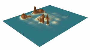
Ola Ahlqvist from the Department of Geography, and his student Hyowon Ban, were already working on a prototype Object using Geographic Information Systems (now called the Movement Density object), and I suggested a collaboration that would take a statistical approach to visualization of the data from “One Flat Thing, reproduced”. My idea was that the need for highly multivariate views could be solved using Parallel Coordinate (PC) plots, and the extra complexity of the time dimension could be incorporated by either adding it to the PC plot or by creating a temporal view. It was an interesting road to follow with some potholes and detours, but we got there.. We used the software called GGobi, which is in the public domain. It has more capabilities (such as 3-D rotation) than we show in our Object, and there are clearly other statistical objects in waiting.
NORAH: As the lead for the data creation on the project, I also found it really productive to have you and Ola around to discuss issues I was having with quantifying qualitative information, the lessons we were learning about how we would do data collection in future projects and quality assurance issues that are common areas of discussion in your professions. I remember at one point when I was explaining the many shifts in terminology and the evolution of the data you said something like “yes of course, this is a pilot project you can expect those kinds of issues’ and it was such a relief to hear. Even terms were useful. For example, Ola gave me the term “attribute data” for our data that describes the dance. On the other side, one of our hopes with this project is that these different disciplinary lenses into seeing structure in the dance might change the way it is viewed. Kind of train the eyes of the collaborators and audiences. Has this been true for you?
NOEL: I think the dance piece is quite stunning, speaking as someone who enjoys modern dance but knows very little about choreography and what it takes to turn it into a performance. I have learned from this project that choreography is very complex, and much of it must be intuitive because it looks too hard to build up from “atoms”. As a scientist, I’ve always believed that science can be artistic. This is an exciting project because I’m working with artists who believe that art can be scientific! I wanted our Object to be stunning in its own way, even as a prototype. I also wanted it to be useful to Bill [Forsythe], to inform him of the consequences of decisions he had made when he choreographed the dance. There is something illuminating and liberating about the spotlight that data and its statistical analysis can shine on things felt intuitively.
Bill also wanted Statistical Counterpoint to be something I could use as a teaching tool in my statistics classes. Statistics is the science of uncertainty. Quite a few people, particularly during election season, think that statistics’ role is to summarize collections of numbers for people to use or abuse! You’ve heard the words, “lies, damned lies, and statistics”…well the reality is that the statistics profession works hard at “the truth, the whole truth, and statistical inference”. We let the data “speak” that truth in myriad ways. Mathematics, probability theory, and computing all play a role in removing the unimportant, leaving behind the essential. Properly chosen statistical summaries can do that. Those summaries are usually most insightful when they can be visualized.
NORAH: Can you talk a little about the Statistical Counterpoint object and some of your initial findings? I know this is just a beginning but I think you’ve found some nice early insights.
NOEL: There are two objects within one and you see them both in the explanatory video. The first is the “Statistical Counterpoint: Cues.” It is a simple object that shows the power of linked visualizations. By brushing on Dancer, we can see dancers’ roles in Cue Giving and Cue Receiving during the dance. We can also see where each dancer gave and received cues and when they did so. Here, a reduced dataset was carved out of the original one; this demonstrates what statisticians call marginalization. Further, brushing is a way to visualize what we call conditioning. In this object, we condition (brush) on Dancer.
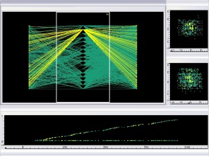
Three basic views of the dance are shown. The first is a multivariate view based on the PC plot, the second is a spatial view based on the location of the dancers on stage, and the third is a temporal view showing, for example, when a cue was given in the dance. At the beginning of the eplanatory vidoe for our object, we show all lines and dots (in green), without the brushing capability turned on. The parallel coordinates on the multivariate view are Cue Giving (the left-hand vertical axis),
Dancer (the middle vertical axis), and Cue Receiving (the right-hand vertical axis). Lines represent relations between dancers and their cueing activity. Dots on the spatial and temporal views are linked to the lines shown in the PC plot. If you watch the explanatory video we made you can notice that the density of lines for Cue Giving is noticeably less than the density of lines for Cue Receiving. This makes sense since a cue given can be received by many dancers. Also, the spatial view showing the density of points on stage for Cue Giving is much less than that for Cue Receiving, reinforcing what we just observed on the PC plot. Second, we notice that
very few cues were given from behind all the tables, but there appears to be a fairly uniform distribution of locations where cues were received. Third, from gaps in the sequence of dots in the temporal view, there were times in the dance when no cues were given at all. These gaps appear to be longer in the middle of the dance than at the beginning or the end.
Then the brushing starts, and the lines and points light up according to each dancer’s role during the dance. We start with Amancio and proceed with the other 16 dancers in alphabetical order. We have a “Cue activity counter” at the top to quantify what is being observed -some dancers have noticeably more involvement in cueing than others. Sang’s count was the most at 86, and he gave roughly as many cues as he received. David’s count was the least at 17, all of which involved his
receiving cues (there were no brushed dots for him in the spatial view of Cue Giving).
NORAH: This is great. One thing to note is that for this version of the dance shot in 2005 Bill added a few dancers (usually it is for 14 dancers, this version is for 17) and David was one of the people he added in for just this video shoot. So that explains why David doesn’t give any cues.
NOEL: It would be interesting to share more of that information in future blog posts.
NORAH: Yes, that’s part of what this blog space is for, absolutely.
NOEL: Anyway, there is a lot more in these plots I’m sure, and this is just the simple object! In the “Statistical Counterpoint : All Systems” a more complex data set is included. It shows all the data, without marginalization. Familiarity with the simple object is helpful for understanding the complex one. In this one, time is now added as one of the parallel coordinates and shades of green have been chosen to reflect the amount of time elapsed during the dance; the darker the green, the more time has elapsed. Conditioning (brushing) is on Theme in this object.
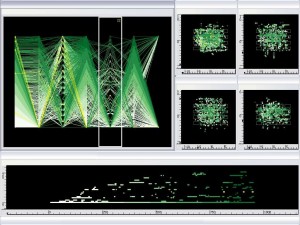
“Statistical Counterpoint” is best viewed as a dynamic animation, where the dynamics are not necessarily derived from the time coordinate. The animation can be stopped, backed up, and studied. The power is in comparing the brushing patterns as the dynamics evolve.
NORAH: What do you think would be the next interesting directions to go with this prototype?
NOEL: My questions include: Can the Statistical Counterpoint Object be made interactive? Can we direct the software to answer specific questions, like at what times do certain dancers give and receive cues from each other? Or, do certain dancers perform certain themes more? You answer these questions in many of your other objects but I wonder if our statistical analysis could provide new information on patterns and interactions. Or, does the statistical dependence pattern, shown in the multivariate view, change in the middle of the dance versus at the beginning or at the end? I look forward to continuing our research and see the potential to publish some of the results.
NORAH: Thanks Noel.
 NORAH: Ola, let’s start with a discussion of your involvement in the project. I’ve had a long term interest in geography because of my previous work in environmental science but for many people the connection between dance and geography might seem surprising.


Recent Comments